Points, lines, shapes, texture, color, and tone come together to create a composition.
The relationships they form is what makes it art.
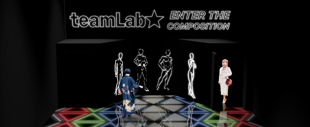
‘Enter the Composition’ is an exploration into the relationship of objects within a composition.
Patrons are invited to experiment within these relationships to create compositions of their own.
As patrons enter the exhibition, they are challenged to learn new poses via a private photo booth. This is a great way to get them warmed up for their photography journey, but also serves a deeper purpose of sampling their look to be used in the “Patterns” exhibition. By creating a place to stand with a certain pose, it will make it easier for cameras to capture patron’s palettes organically.
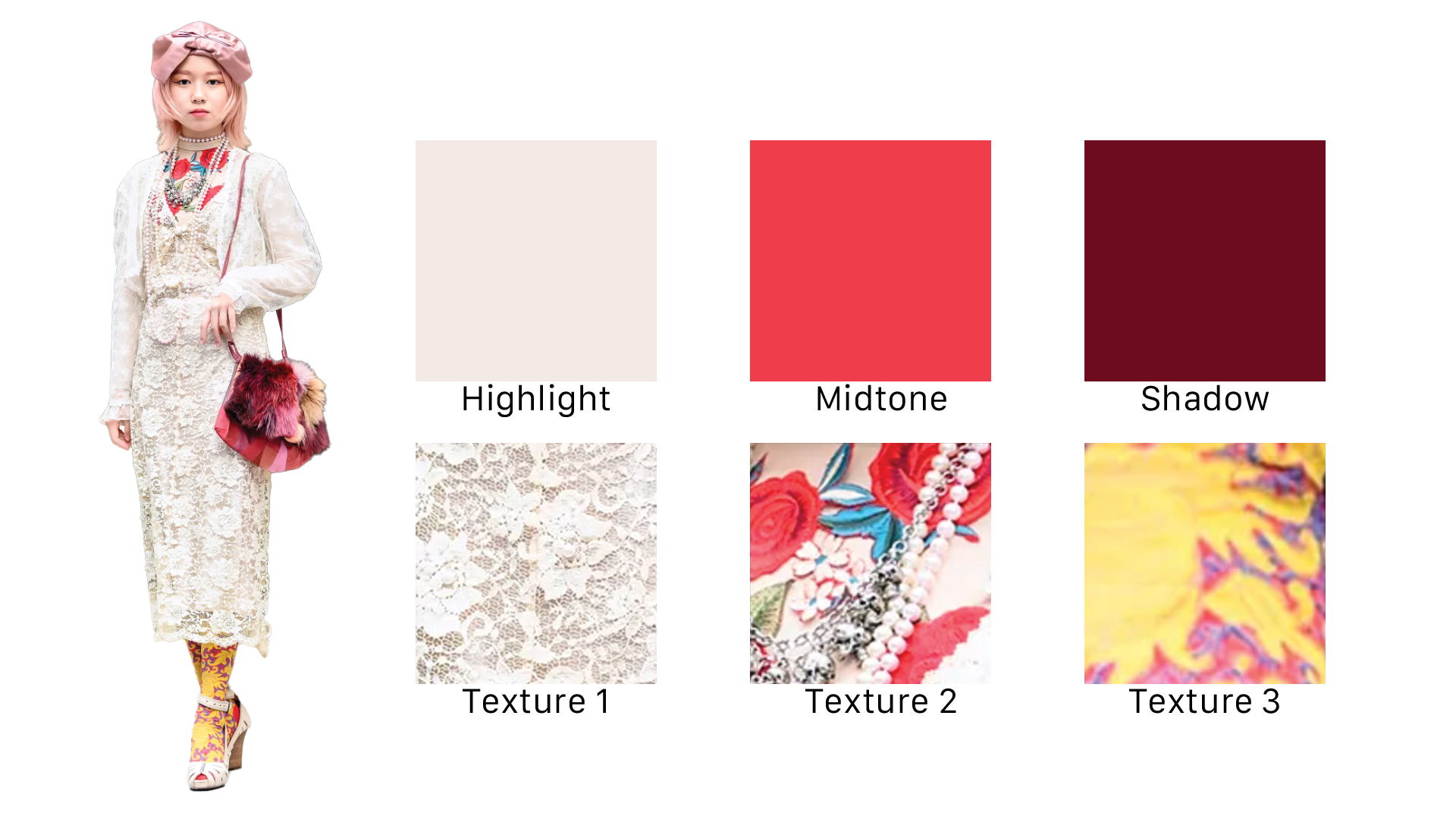
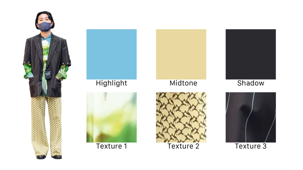
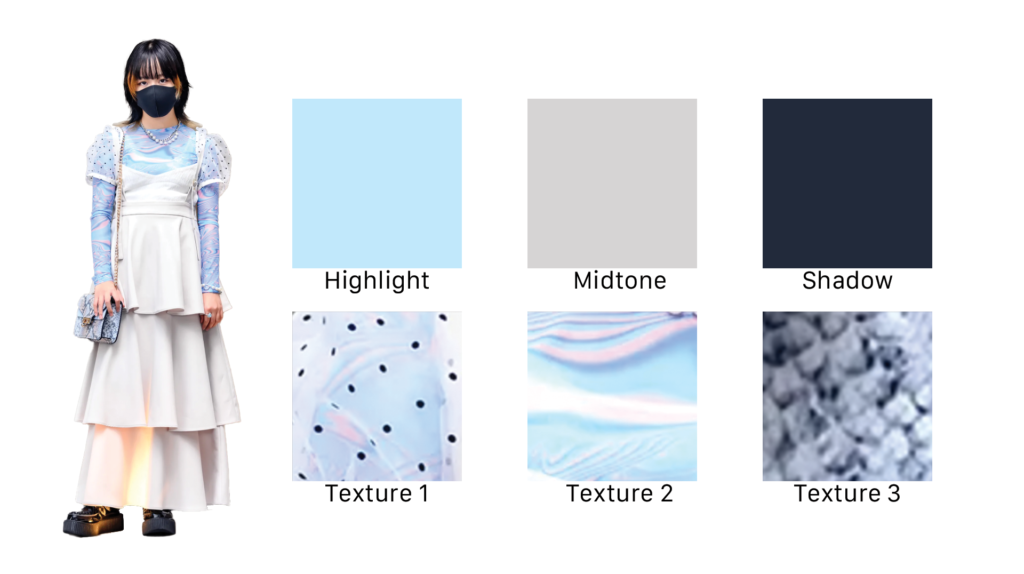
The photo booth will capture a dynamic range of colors (a highlight, a midtone, and a shadow) as well as 3 textures.
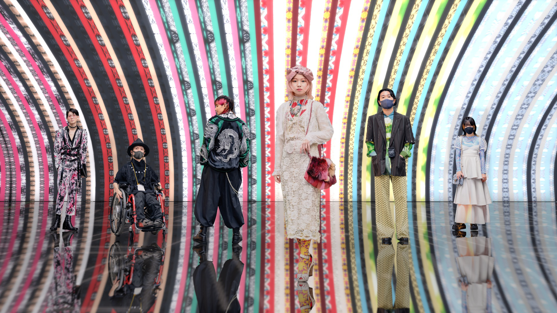
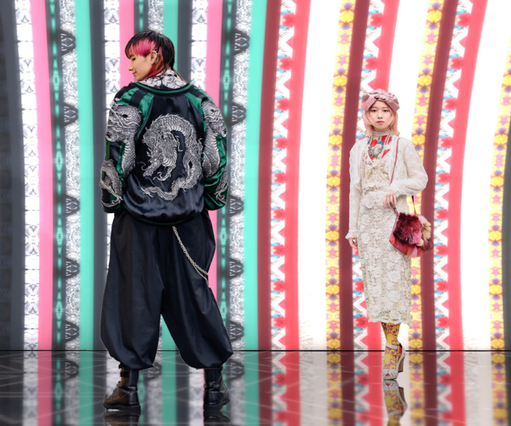
The palette will then be extrapolated into seamless textures in order to create a living wallpaper.
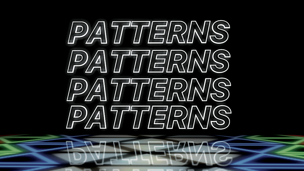
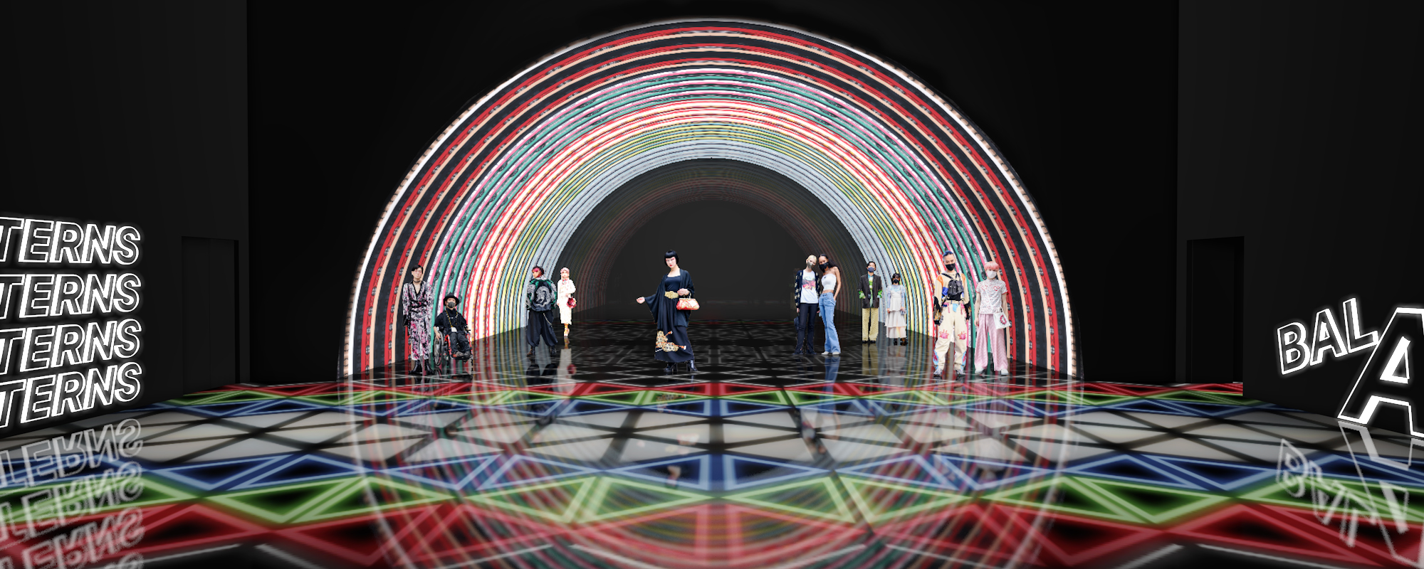
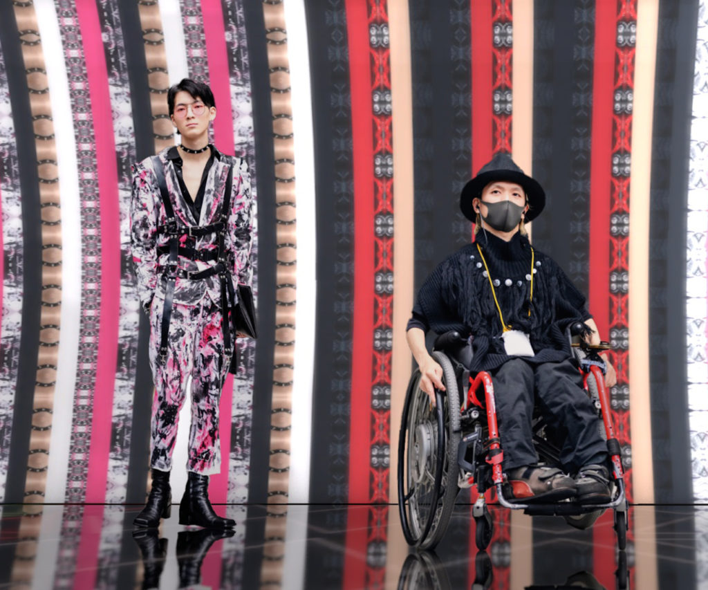
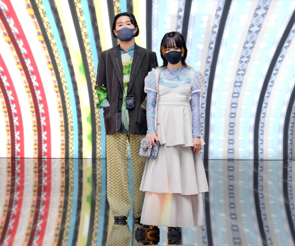
Patrons will be amazed to find their own styles reflected on the walls of an exhibit that will never be the same twice. It also encourages them to come back with interesting outfits to create even better textures. I used stripes in my example, but the textures should be able to easily translate to any mapped animated design. However, there should still be an opportunity for patrons to take photos with their personal palettes (such as a slow crawling wallpaper).
The inspiration behind the design of the “Patterns” section is to take a walk inside a camera lens (aiming for Canon sponsorship). The desired effect can be achieved by creating an arch of LED screens and utilizing a reflective floor surface. It ends with a glass wall (lens) that leads into the “Space” section.
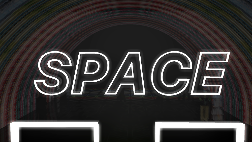
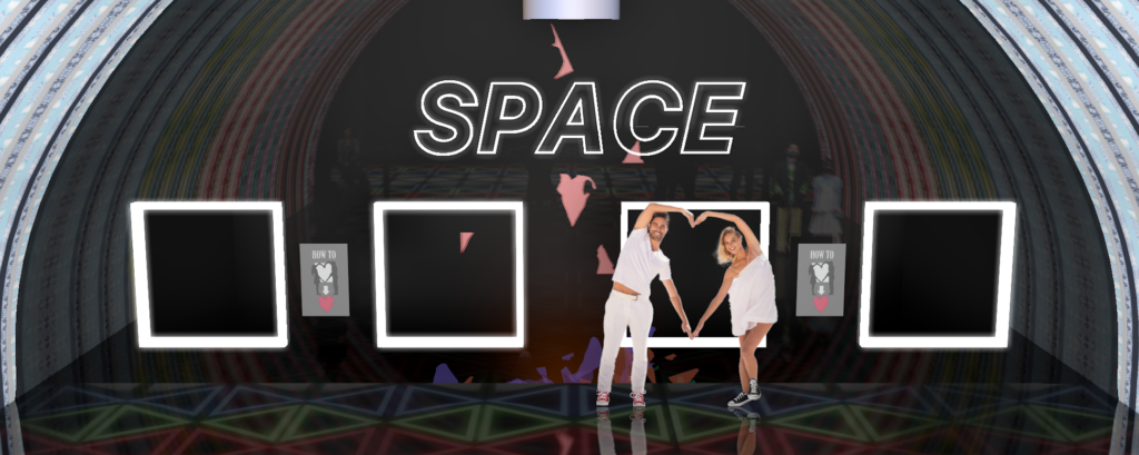
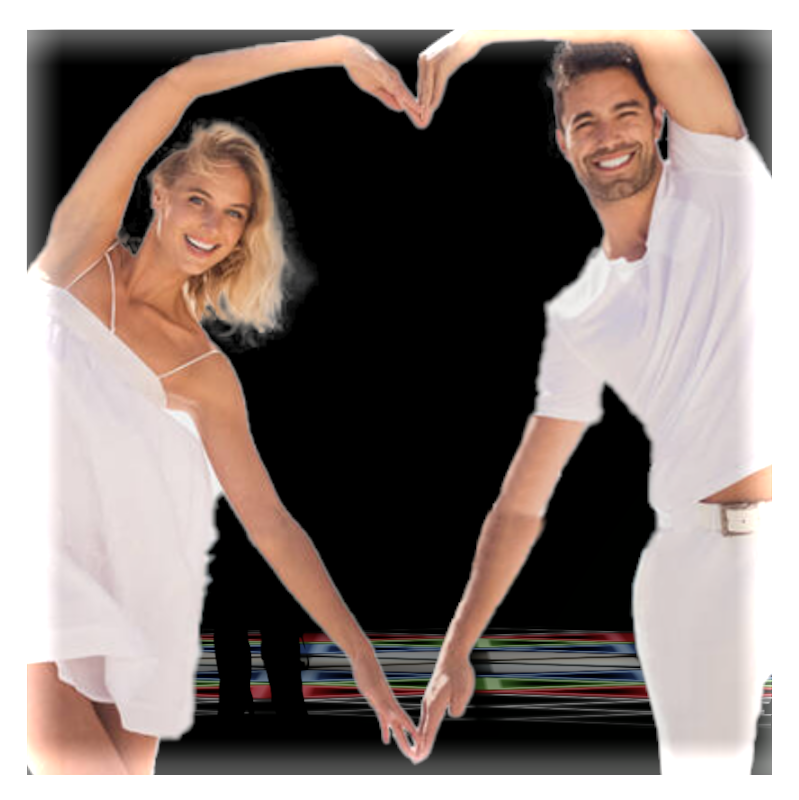
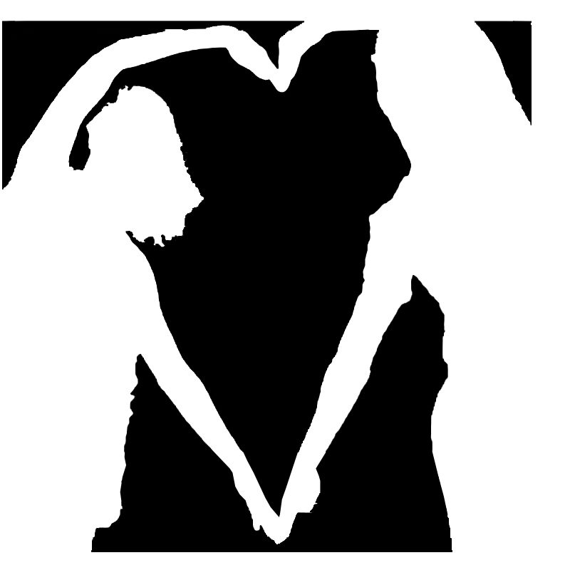
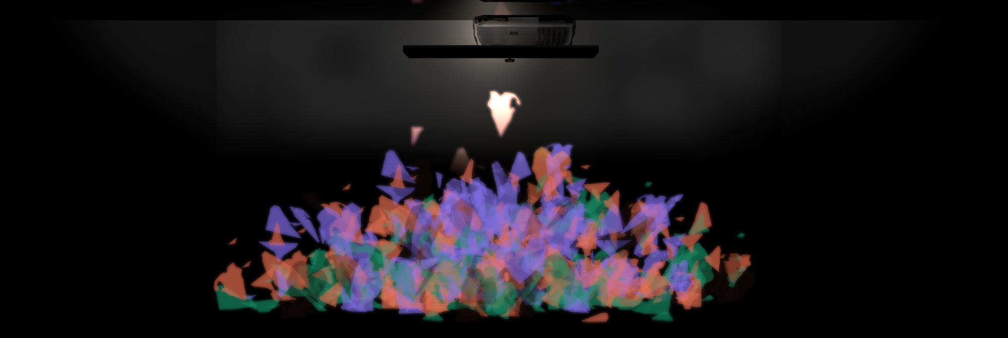
Negative and positive space both have big impacts within a composition. While positive space is easy to recognize, it’s harder to visualize negative space. This experiment will give patrons the opportunity to create new shapes by utilizing the negative space around their bodies.
Each box will have a camera aimed at it to detect the positive and negative space. Originally, I thought to have a solid bright background behind the box, but I am hoping with modern technology that we can use body detection or possibly heat-mapping software to find the subject within the outlined frame. A bonus effect is if there is no body detected, it will prevent the system from constantly producing negative square shapes. Once the negative shapes have been detected, they will be extruded with an added colored glowing transparent texture.
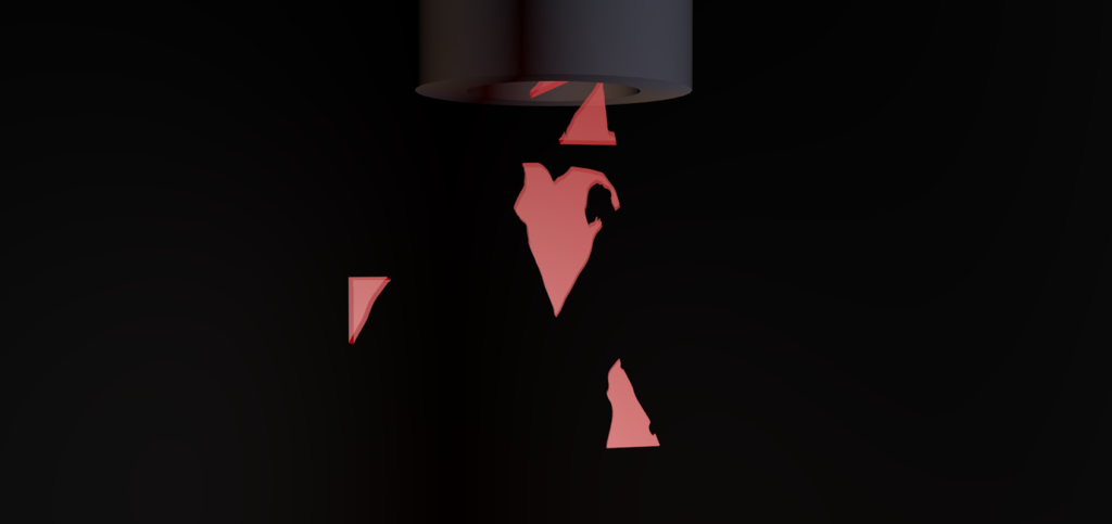
All of the “negative objects” that are created go into the ephemeral graveyard.
It is a constantly changing ever-growing pile of the negative space around us.
If I were to dream big, I would make the “Space” section into a giant Pepper’s ghost to
really enhance the 3d quality of the ephemeral graveyard.
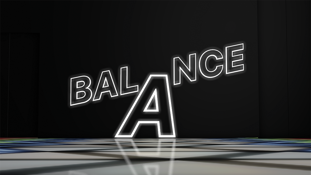
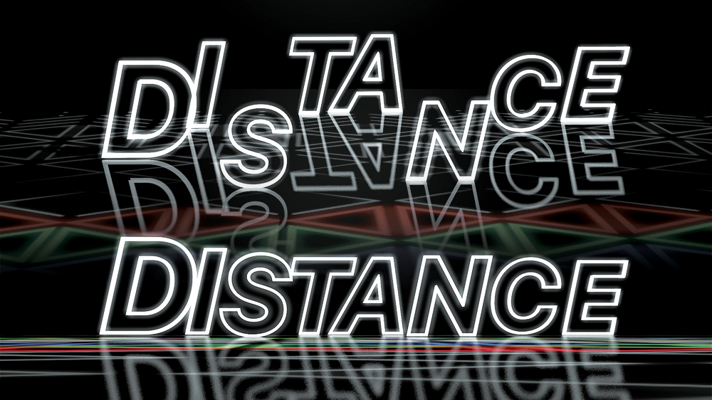
As this is only a proposal, I did not go in depth into my ideas for “Balance” and “Distance”.
You will just have to hire me to learn more!
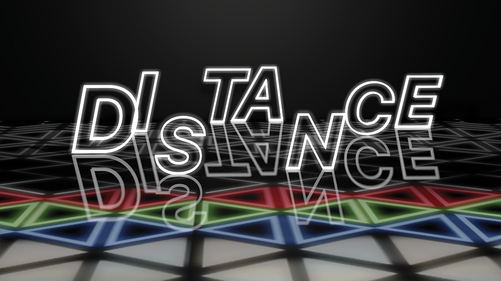
However, I will say that “Balance” would be an exercise involving visual weight mixed with real world weighted objects. “Distance” is a room that depending on your perspective allows you to reveal new shapes, objects and ideas. “Distance” draws inspiration from Matthieu Robert-Ortis, but would be set in a large space with multiple overlapping structures/sculptures for patrons to walk around and discover.
ENTER THE COMPOSITION
My ideas for this exhibition expand beyond the confines of this 3D flythrough, but I wanted to provide a preliminary imagined space where my ideas coexist as well as provide a current example of my 3D skills.


